Hey Honey –
Posted March 27, 2021 in Special Features
It seems like having a Color of the Year is becoming popular among many companies. Last week, I mentioned that varying paint companies have chosen ocean-like colors as their premiere 2021 color choices. So it only makes sense that manufacturers of kitchen appliances and other household items would make color selections too. These companies have chosen colors that coordinate with Benjamin Moore’s 2021 Aegean Teal or the Canyon Dusk, an earthy terra cotta color made by Behr.
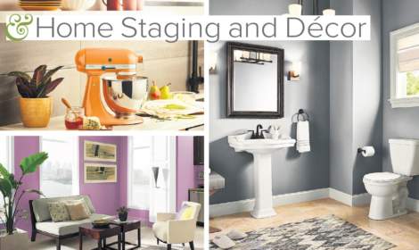
KitchenAid chose Honey as their 2021 color which looks like a mix between persimmon and tangerine. You can find the color on their small appliances as well as on their Artisan Stand Mixer. The golden orange color is able to be coordinated throughout the home as stores such as Wal-Mart are carrying items which complement KitchenAid’s Color of the Year choice. I’ve been told you can even buy slippers to match you in your kitchen.
Whether you want to add energy to a dull room or help bring some calm to a busy room, there is a color for you. The colors in 2021 are being described as livable. When you coordinate color with the neutral paint Colors of the Year, your home will remain timeless and grow with you as your style and needs change.
Pantone which is the universal language system for color for all brands and manufacturers chose two colors for 2021. Its first color choice is Ultimate Gray which is one of our oceanic colors that will be a reliable choice for our walls. The Ultimate Gray color was chosen by Pantone for its source of strength and dependability. The second color named Illuminating is a bright and warm yellow. The yellow was selected to bring hopefulness and optimism and to give livability to the gray.
Is gray the new beige? More than half of Benjamin Moore’s top-selling paint colors are shades of gray. Gray is extremely versatile. Some grays tend to look a little beige and sometimes have hints of green. When choosing colors, I always recommend placing the color sample on the wall and checking the color several times during the day as the daylight changes within the room before buying the paint.
When choosing a room to paint first, the design process for that room will be driven by the color palette, so choose a room that you would likely spend lots of time to get the most enjoyment from painting it. If you are absolutely unsure of which colors to select, I recommend finding an item for that room that has the colors already coordinated in it. It might be a piece of fabric, a pillow or even a coffee cup. Seeing useful items with the colors we love, tells us whether we have a preference for bold and bright or something comforting or maybe even something with an attitude. As a designer, I use color to attract attention and convey the meaning of the space.
Keep in mind that if you have something in a room that is keeping you from selecting a particular color, you might be able to paint the item. There are professionals that will paint furniture pieces for you as well as offer specialty paint for you to paint the furniture. Chalk paints have become very popular for painting furniture. Chalk paints can be applied to veneer, wood, cabinetry and even fabric and upholstery and can offer a remedy to a difficult color that currently exists on an item.
If you are seeking comfort in colors, I like using a base color of the Aegean Teal with oatmeal colored accents and the earthy Big Cypress (Benjamin Moore’s) woodsy color. Behr’s Canyon Dusk is the warm and cozy neutral that is great for bedrooms and bathrooms. You might add plants with this color to turn the space into a sanctuary.
If you are going for bold, consider a vibrant orchid color which offers optimism. The orchid color with blues such as Lazuli Blue and Dark Oak, both by Benjamin Moore work extremely well as we enter the spring-summer season. Behr offers a Euphoric Magenta which also complements the neutral tones found in the Colors of the Year. Additionally, if you like the Honey color selected by KitchenAid, you might like Saffron Strands and Barnwood Gray by Behr.

Call me at 360.635.1121 to help you make the best color decisions to help you sell your home. You can also email me at DianneMorrisHomes@gmail.com
